Taking a look back at data layers in the past Simcity series, they were generally colored tiles that indicated whether a tile was powered, watered, polluted, etc. These data layers were pretty boring to look at, but, the new Simcity plans to change all this by rethinking how the data layer is represented.
Taking some inspiration from infographics, Simcity aims to mix data visualization with modern design. The intent is to create animated data visualization so the player can see it flow in real time.
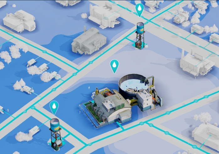
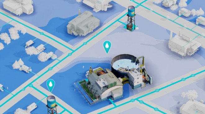
In this screenshot above, the water table is visible underneath all buildings. The more bluer areas contain more water. When the water tower is placed and pipes are laid down to different buildings, the player will see the water (agents) flow to different buildings.
Christian Stratton, User Experience Director for Simcity, gave an example of how you’ll see power travel down power lines. When you place a power plant down, the player will see power flow away from the plant to nearby buildings. If there’s any breaks among those lines, the player would immediately see and recognize it. If the power plant isn’t capable of providing power to a far location, you will see the power get “eaten-up” before it reaches there.
The data layers are also integrated into the game itself. As you place down a fire station, you’ll see a basic data layer that will give you a general idea of where you should place the fire station. There’s also the option to see a more in-depth data layer if the player requests it.


